Sparkline
The sparkline dashlet displays multiples gauges and timelines to help end-users compare KPIs, visualize trends and spikes and highlight thresholds for performance metrics. It creates a synthetic executive visualization of the network and synthetic health-check of devices.
Create a sparkline dashlet by clicking
 in the edition tool bar.
in the edition tool bar.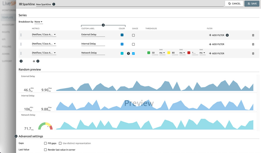
1. Name your dashlet.
2. Select KPIs from the KPI library.
3. Move the series.
4. Sketch the style of the different lines.
5. Add a gauge to the sparkline.
6. Filter the data set.